Last Updated on September 8, 2023
Smart investing is all about using the right tools. Whether trying to measure volatility metrics or understanding price action, one cannot make informed trading decisions without the proper resources. One such resource is the market profile chart. First used in 1984, the market profile function organizes various trading data easily so traders and investors can make informed trading decisions.
What is Market Profile in Trading?
Market Profile (MP) is simply a unique form of charting to help traders better understand price action and trading activity in a particular market. It was officially introduced in 1984 by renowned author and independent trader J. Peter Steidlmayer for the Chicago Board of Trade (CBOT).
Steidlmayer created the MP chart to represent price acceptance or rejection over a given period using graphical distribution. Since its introduction, market profile charts have provided an improved way of looking at markets and paved the way for more rational market analyses.
Before proceeding further, it’s important to note that a market profile chart is not a technical indicator, even though it is a helpful tool for traders. Instead, it’s an image that provides an in-depth look into the current state of the market by capturing where the most traded price is and the volume at each price level.
It’s also important to not confuse market profile in trading with building a marketing profile in business. In this context, a market profile chart displays the asset’s trading history using a series of letters and/or colors to represent price action over time, usually 24 hours.
The chart essentially demonstrates the security’s volatility while also capturing the price-to-volume ratios at any given time. Simply put, it shows you how much of an asset was traded at a particular price and over a particular period.
MP charts go by other names, including Sierra Chart’s Time-Price Opportunity (TPO), Volume Profile charts, and the Sierra chart scale.

Why is Market Profile Important in Trading?
Because a market profile displays price, volume, and time frame on a single chart, traders can use it to determine any security’s value areas and points of control.
In other words, traders can use it to gauge market trends and track price action as it unfolds. This allows them to gain valuable insight into the price, time, and volume analysis, which enables them to decide on the best course of action — buy, sell, or hold.
Market profile charts are also great for identifying price levels that have been accepted or rejected by the market. This is good for identifying support and resistance levels on the chart and anticipating upcoming price movements. This allows traders to determine when the market has moved from equilibrium to a state of imbalance.
One of the best things about a market profile is that it works in all market conditions. Most technical indicators or trading systems only work under certain market conditions, such as upwards or downwards trending. A market profile isn’t subject to such restrictions since it allows users to clearly identify balanced and imbalanced market conditions (whether upward or downward) at all times.
How to Read a Market Profile Chart
At first glance, the market profile chart looks like an indiscernible mashup of letters and colors. But reading the chart is actually not that complicated. The first thing to note is that this chart shows you price action across a particular time frame.
There are three main things that market profile tells us:
- The action of the market over a given period.
- The most important prices of the day.
- How price and time correlate at certain times during that day.
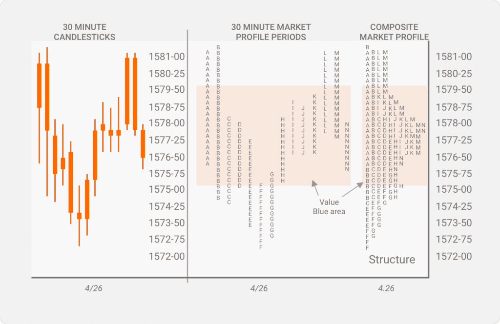
Like any other trading chart, market profile charts display the volume on the horizontal (x-axis) and the price on the vertical scale (y-axis).
The volume is displayed as a horizontal histogram where the longest horizontal lines represent the highest trading volume for that period. The price is the point of control (POC) since it had the most control of the market.
On the market profile chart, only a few select timeframes are available. The most common ones are 5-minute, 30-minute, daily, weekly, and monthly. Many traders focus on the 30-minute timeframe.
So let’s say you’re looking at a 30-minute market profile chart. The time frame comprises letters and/or varying colors. Each letter represents a segment of time. Each letter represents 30 minutes of trading for that particular asset.
Key Points on the Market Profile Chart
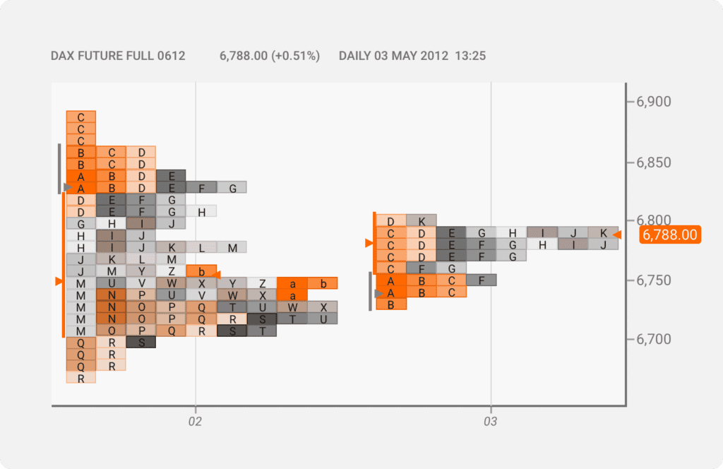
Look at the chart above. It is a market profile chart for DAX Futures. The time frame is set to daily intervals. Here’s what it tells us:
- The red triangle (POC) is the price range at which the trading volume was at its highest. As you can see it corresponds with one of the longest horizontal lines on the chart.
- The red line shows us the price range for the bulk of the trading that occurred during that period.
- The blue line shows the initial price range where trading occurred during the period.
- The green triangle represents the opening price.
Positioning your cursor on each colored letter will bring up additional information about that period, including:
- Number of ticks occurred.
- Amount of volume exchanged.
- How many boxes are in the profile.
- How many boxes are below and above the POC.
- Open, high, low, and close prices.
Depending on your trading system, you can also include custom information to be displayed when you place your cursor over the boxes.
Time Price Opportunity (TPO)
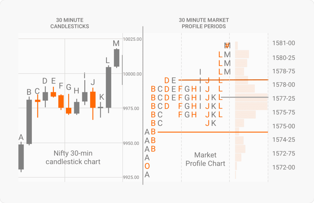
The best way to understand TPO is to first examine the standard candlesticks or bars to read financial charts.
Typically, we have our open and close areas on each candlestick. If the candlestick is red, we know the price opened at the top part of the candle and closed at the bottom. If green, we know it opened at the low end of the candlestick and closed at the top.
The problem here is that we don’t really know where prices were focused during a particular period within the candlesticks. So let’s say you’re looking at a 30-minute green candlestick. You know where the price opened, where it closed, and that the price moved upwards. But it doesn’t tell you how long the price stayed at a certain portion of that candle.
That’s where the TPO comes in. It enables traders to transact at a specific price during a given time period. Every time the market reaches a new price, the market profile chart creates a new TPO. Basically, it identifies opportunities created in the market at a certain time and price.
The Bell Curve
You’ll notice that most market profile charts are shaped with lower slopes on either end while the middle area is protruding, kind of like a bell. This represents a typical trading scenario in which trading volumes tend to be much higher when the market is most active during the day.
This is known as the Bell Curve and is majorly influenced by the market participants within that period.
For example, let’s say an asset is trading at $80. Institutional buyers and big players want to buy when the price is at $50 or lower. On the other hand, big sellers want to sell only when $120 or higher.
If these are the only players in the market, the asset price will remain at $80 since neither party intends to trade at this level. But then we have other players in the market — day traders, scalpers, swing traders, etc.
Once these players enter the market, the asset price will go higher or lower depending on their combined efforts. If the price goes down and reaches the $50 mark, the big buyers will start placing their trades. Conversely, the big sellers will also place their trades if the price goes up to the $120 mark.
As expected, this interaction will significantly affect the trading volume for that period. Remember that the longer the horizontal line of TPOs on the chart, the higher the trading volume. This is what causes the line to protrude and result in the bell-shaped curve.
Market Profile Levels
The best way to appreciate the importance of the Bell Curve in an MP chart is to understand the Market Profile levels. There are two main levels to consider here — Value Area and POC. Let’s look at each one in turn for a clearer picture.
Value Area
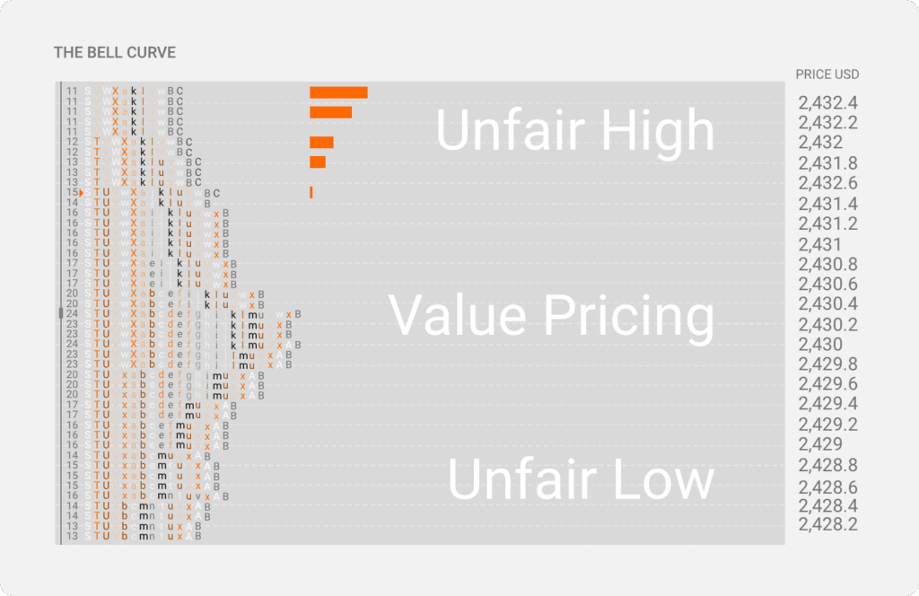
Now we already know that every marketplace is set up to facilitate trades. We also know that the security’s price will go up until the last buyer has placed their order and there are no more buyers at a rising price. This is what we call an Unfair High (higher end of the Bell Curve).
On the other end, the security’s price will go down until the last seller has sold and there are no more sellers at a falling price. We call this an Unfair Low (lower end of the Bell Curve).
As trading continues, the market will eventually define a range with an unfair high and an unfair low. Once this occurs, we refer to that portion on the chart between the unfair high and low as the Value Area. This is where the market records the most action over a given period.
The Value Area helps traders understand when they should get into a trade. Remember, of course, that the market profile is not a trading system that tells you when to buy or sell. Rather, it’s a support tool that helps confirm your trades based on price action and volume at a particular time period.
Within the Value Area is the Fair Price. This is where the asset price is expected to move once the big players have entered the market.
So how does this help make informed trading decisions?
Well, if you know where the price is expected to move over a given period, you can confirm the market trend and place your buy/sell order accordingly. So if you’re looking to go long over a mid to long-term period, you can buy when the price is down at the Unfair Low area since there isn’t much action yet, and you’re expecting the price to gravitate upwards towards the Fair Price.
In the same vein, if you are a long-term seller, then the ideal place to sell will be when the price is up in the Unfair High area. There isn’t much action yet, and you’re expecting the price to drop down to the Fair Price area once the big sellers enter the market.
Can you buy or sell at the Fair Price area? Absolutely, but you probably wouldn’t make as much profit because of trading volume and volatility peak in that area.
Point of Control
We already brushed up on POC earlier. It’s simply the price level where traders spent the most time, and the market recorded the highest volume for that day. You can easily spot the Point of Control on the Market Profile chart by looking at the largest TPO rows.
The POC is usually closest to the center of the Value Area. Many traders consider it the fairest price for market participants to trade. As such, if you want to trade within the Value Area, you’ll want to place your trades (buying or selling) at the POC. Anything above or below the POC is a gamble.
Market Profile Day Types
There are two main types of days in the modern Market Profile — Range days and Trend days. Traders who understand these different day types and can identify what kind of day is developing early on have a distinct edge. This is because they have an idea of what to expect from the market before the close.
There’s usually a lack of directional conviction from both buyers and sellers in the market on range days. Here, traders typically look to fade deviations from the Value Area and trade using the mean reversion style.
On the other hand, trend days are characterized by continuous directional price movements. Here, traders are typically looking to utilize a trend-following style. This means entering trading on a breakout or pullback and then riding the prevailing market trend to profitability.
Variants within the range and trend days.
- Normal Day — This is the most basic day structure and features a slight one-direction extension beyond the Initial Balance Period (IBP).
- Normal Variation Day — There’s a one-direction extension beyond the IBP as well as a relatively wide rotation in market development for most of the day.
- Neutral Day — There’s a price extension on both sides of the IBP and neither Other Time Frame (OTF) buyers or sellers have directional control.
- Non-Trend Day — There’s no extension outside the IBP and no involvement by OTF buyers or sellers.
- Trend Day — There’s a wide range in the market and either OTF buyers or sellers are pretty much in control.
- Double Distribution Day — Usually starts off like a Trend Day but then new information enters the market, influencing the price.
How to Improve Your Trading Using Market Profile
Market Profile charts can help with trading confirmations when used as part of a broader trading system. These charts also make it easy to identify support and resistance levels and how price action interacts with the point of control and trading volume.
Instead of trying to trade using static candlesticks, market profile provides additional context to better understand where changes in supply and demand are really taking place.
As a savvy day trader, you can use these valuable pieces of information to trade bounces at the support level after confirming the most recent POC. On the other hand, a swing trader could use the Market Profile chart to trade breakouts based on the POC of the previous day.
As with all techniques and systems, using market profile to improve your trading requires patience and practice. Take advantage of virtual trading simulators to hone your skill before hitting the live markets. When you feel comfortable enough to trade real money, remember to take it slow. The markets can be quite unforgiving, especially during periods of high volatility.
…the difference between traditional technical analysis and Market Profile is that traditional technical analysis tries to predict the future based on the past. Market Profile tries to identify the underlying conditions of the current market’s movement for continuation or change.”
– J. Peter Steidlmayer